
Singer-Songwriter Squarespace Website Redesign: Mary Gauthier
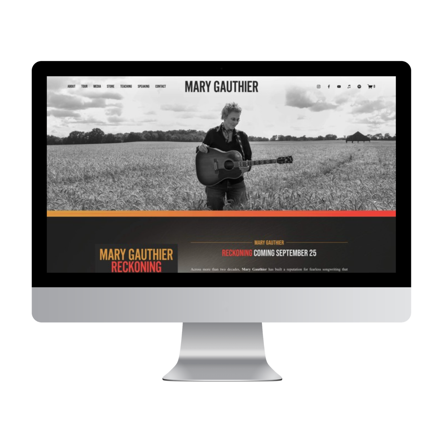
A website that's been serving an artist for nearly a decade doesn't always need to be replaced. Sometimes, it needs to be edited.
Grammy-nominated singer-songwriter, author, speaker, and songwriting teacher Mary Gauthier has been a Designing the Row client since the beginning. I originally designed Mary's website during my first year in business, and over the years we've updated it alongside new albums, tours, books, workshops, and other chapters of her career.
With the announcement of her newest album, Reckoning, it was time for another evolution, but this one called for more than swapping out album artwork.
After nearly ten years of adding to an already hard-working website, we stripped things back, cleaned up the content and navigation, and created a simpler online home built around where Mary's career is today.
The redesigned website launched alongside the announcement of Reckoning. And today, as this case study goes live, so does the album.
A Website That Has Evolved With the Artist
One of my favorite things about working with longtime clients is seeing how their websites change as their careers do.
Mary's site has never been static. Over the years, we've refreshed it for album releases and added content as new projects and opportunities became part of her work.
But there's a point where continually adding something new stops being the answer.
Nearly a decade of updates had created an opportunity to look at the website as a whole again: What still needs to be here? What can go? What deserves more prominence now? And how can we make it easier for visitors to understand the full scope of Mary's work?
Instead of adding another layer for Reckoning, this refresh became an opportunity to simplify.
Designing Around Reckoning
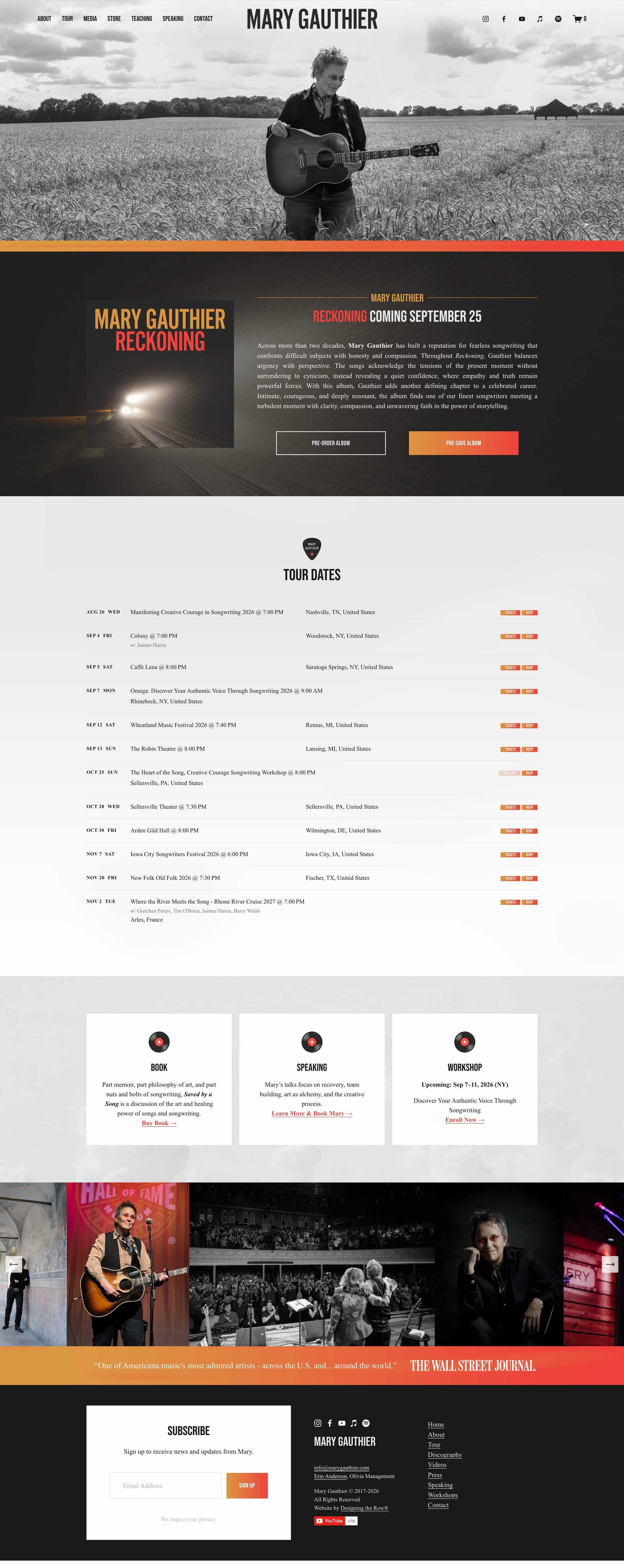
As with many artist website redesigns, the album artwork provided a natural starting point for the new visual direction.
The dark, atmospheric imagery and warm orange-to-red color palette surrounding Reckoning became the foundation for the website. Black, white, and gray keep the overall design restrained, while the album colors appear strategically in accents and calls to action.
Small custom graphic elements were created to coordinate with the album aesthetic and carry that visual language into sections beyond the release itself.
The goal wasn't to make every inch of the website look like an album cover. It was to take the visual world already established for Reckoning and translate it into a flexible website design that could support the rest of Mary's career, too.
Putting the New Album Front and Center
With Reckoning arriving, the new album naturally takes priority on the homepage.
Visitors are introduced to the project immediately, with the album artwork, release information, a brief introduction, and clear paths to listen and purchase.
The website redesign originally launched alongside the album announcement, giving Mary an updated digital home for the entire release campaign. Now, as Reckoning officially arrives, that same website transitions naturally from promoting what's coming to supporting what's here.
That's one of the advantages of designing an album-release website with longevity in mind: the site can support the announcement, pre-order period, release day, and life of the album afterward without needing to be redesigned at every stage.
More Than a Musician Website
Mary's website has to do something many artist websites don't.
It has to represent several interconnected parts of her career.
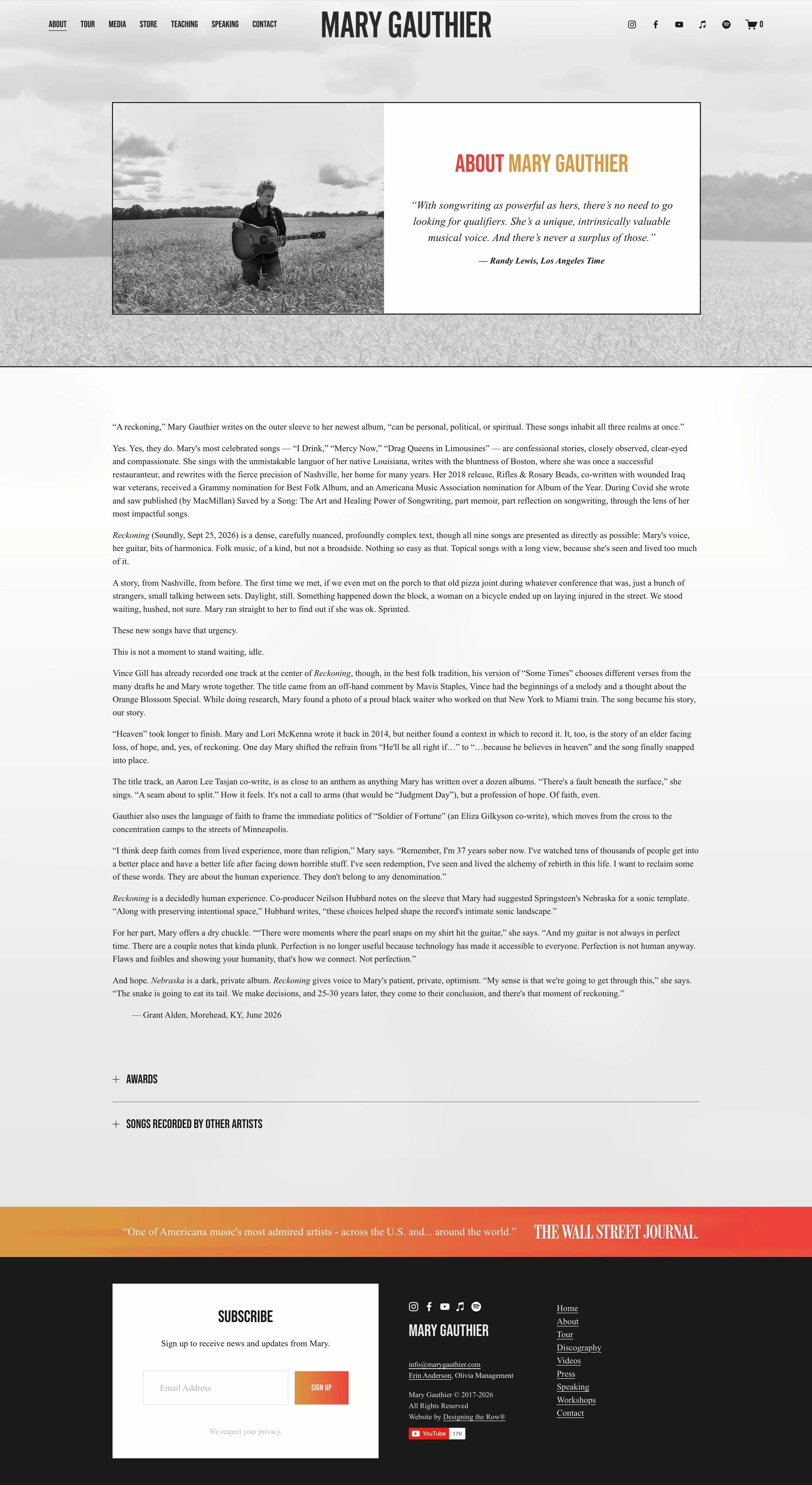
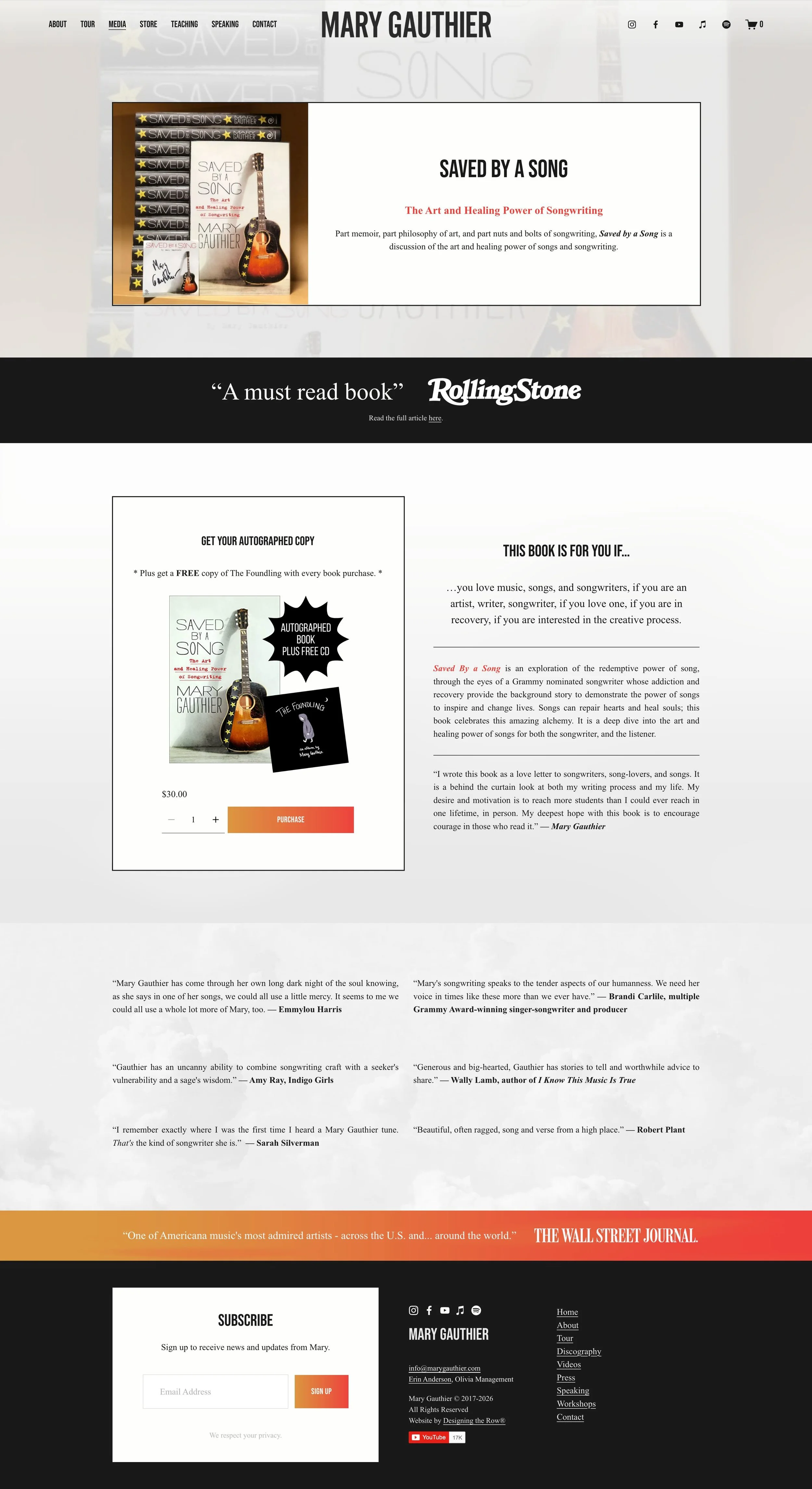
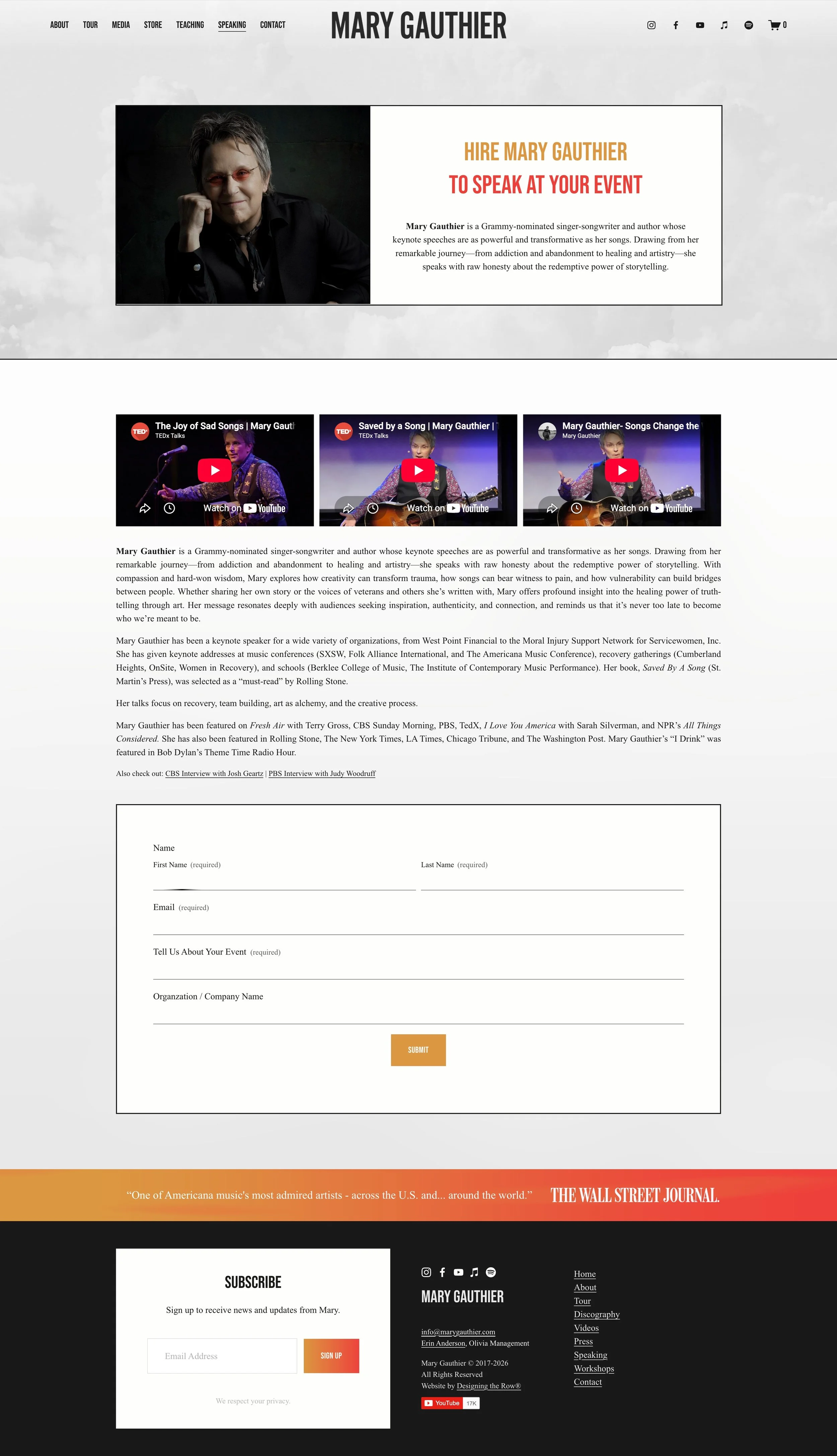
Mary is an acclaimed singer-songwriter and touring artist, but she's also an author, speaker, and teacher. Her book explores the art and craft of songwriting, and she leads songwriting workshops that help others explore their own stories and creative process.
Rather than separating these pursuits into disconnected online identities, the website brings them together.
Prominent pathways for Mary's book, speaking, and songwriting workshops sit alongside her music and tour dates, allowing visitors to immediately understand that her work extends beyond the stage.
It's still unmistakably an artist website, but one designed around the full career of the artist.
Simplifying the User Experience
Cleaning up a longtime website isn't only about making it look more modern.
It's also an opportunity to make decisions.
Over time, websites naturally accumulate pages, links, sections, announcements, and content that made perfect sense when they were added. Years later, they can make the experience feel more complicated than it needs to be.
For Mary's redesign, we intentionally stripped the site back and created a clearer hierarchy around what matters now.
New music and tour dates receive immediate attention. Visitors interested in the deeper body of Mary's work can easily find her biography, discography, videos, press, book, speaking, workshops, and contact information without the homepage trying to tell every story at once.
The result is a website that feels lighter and easier to navigate while still supporting a remarkably multifaceted career.
Tour Dates & Tickets
Touring remains an important part of Mary's work, so upcoming dates are given prominent placement directly beneath the new album.
The tour section is intentionally simple: dates, venues, locations, and ticket links are easy to scan without unnecessary visual distractions.
For an artist with an active touring schedule, that's an important distinction. This portion of the website isn't primarily there to impress someone with its design, it's there to help someone find a show and buy a ticket.
Good website design knows when to create an experience and when to simply make something easy.

Creating a Website With Room for Every Audience
An established artist's website can have many different visitors.
One person may arrive after hearing a song for the first time. Another may be a longtime fan looking for tour dates. Someone else may want to book Mary for a speaking engagement, attend a songwriting workshop, read her book, research her discography, or find information for press.
The website has to give all of those people a path forward without presenting everything with equal visual weight.
That's why hierarchy became such an important part of this redesign.
The homepage tells visitors what's happening now, while the larger website preserves the depth of Mary's body of work for the people who want to explore further.
Mobile Website Design
For a touring artist, author, and speaker, visitors can arrive at a website from almost anywhere—a streaming platform, social media post, concert listing, podcast, workshop recommendation, or Google search.
The redesigned website was built responsively so the same hierarchy carries through to mobile devices.
New music, tour dates, tickets, and the different facets of Mary's work remain easy to discover without sacrificing the visual identity inspired by Reckoning.
Built on Squarespace
As a Squarespace Authorized Trainer, Squarespace Expert, and Squarespace Circle Member, one of the things I value most about Squarespace is its ability to evolve alongside a business or creative career.
Mary's website is a perfect example.
We've been able to use the same platform throughout nearly a decade of albums, tours, projects, and career growth… sometimes making smaller updates and, when necessary, stepping back to rethink the experience more substantially.
This time, the right answer wasn't a completely different platform or an unnecessarily complicated rebuild. It was taking everything that had accumulated over the years and thoughtfully deciding what Mary's website needed for its next chapter.
Website Features Included
Squarespace artist website redesign
New album release promotion (Feature.fm)
Custom styling inspired by album artwork
Tour dates and ticket links (Bandsintown)
Music and discography (Spotify embeds)
Author and book promotion
Professional speaking information
Songwriting workshop promotion
Biography and press resources (All Eyes Media)
Video content (YouTube)
Email list integration
Online store access (Squarespace E-commerce)
Mobile-responsive design
Search engine optimization (SEO) foundations
Does Your Artist Website Still Reflect Your Career?
A website that worked beautifully five or ten years ago may not represent everything your career has become.
Maybe you've released several albums since then. Written a book. Started speaking or teaching. Added new revenue streams. Or simply accumulated so much content that the website no longer feels as clear as it once did.
You don't necessarily need to throw everything away and start over.
Sometimes the most effective redesign begins by identifying what's still serving you, removing what isn't, and creating a clearer online home for the work you're doing now.
I design and refresh Squarespace websites for musicians, authors, speakers, and creatives whose careers don't always fit neatly into one box. If you're ready for a custom Squarespace website that tells your story and gives visitors a place to truly connect with your work, we’d love to help.
About the Designer
Hi, I'm Katherine Forbes, founder of Designing the Row. I'm a Squarespace Authorized Trainer, Squarespace Expert, and Squarespace Circle Member who has designed more than 300 custom Squarespace websites for musicians, authors, nonprofits, speakers, and small businesses.

Grammy-nominated singer-songwriter, author, speaker, and songwriting teacher Mary Gauthier has been a Designing the Row client since the beginning. I originally designed Mary's website during my first year in business, and over the years we've updated it alongside new albums, tours, books, workshops, and other chapters of her career.