Website Content Mistakes Keeping You From Growing Your Business
About this Squarespace video tutorial
As a designer, I've seen a few frequent website content mistakes that trip up clients and keep their websites in development. Today, I'll go over some of these issues and what you need to do to prevent them from stalling your website progress.
Timestamps
0:00 - Intro
1:27 - Messy Site Structure
4:41 - The Blank Page
8:12 - Services
9:50 - What I'm Doing On My Site
13:59 - Quiz Experiment
Want 20% off your new Squarespace subscription?
Subscribe to the Designing the Row® email list and get the exclusive code sent straight to your inbox. You’ll get email updates when new Squarespace tutorials are published, but you can unsubscribe at any time.
The Website Content Mistakes Keeping You From Growing Your Business
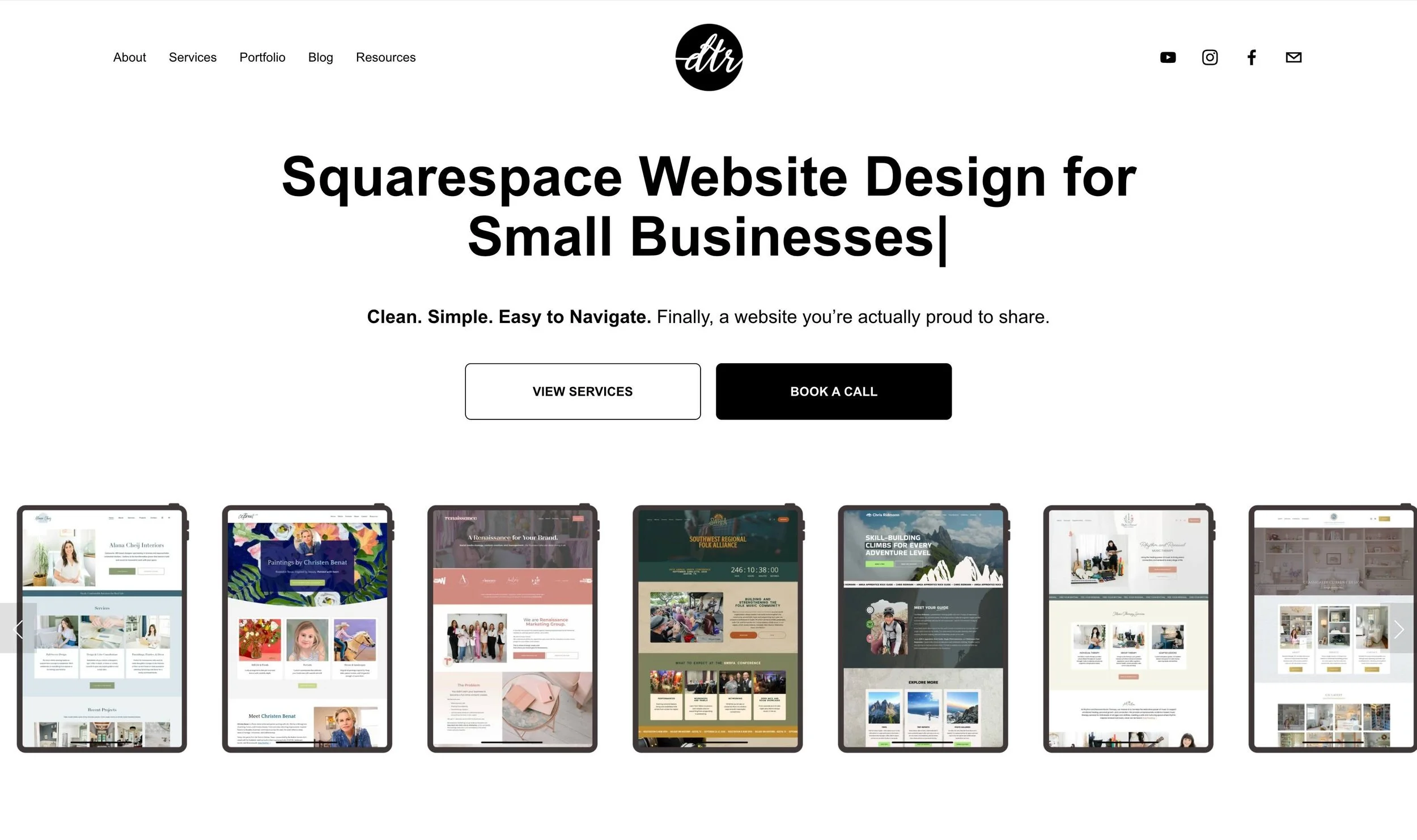
After designing over 300 client websites, I’ve noticed a trend that has absolutely nothing to do with design being a core issue of a website’s success. It has everything to do with how close you are to your own expertise to communicate what you need to to your audience in a website format. Today I’m going to break down the 3 content traps I see people fall into all the time so they can avoid them and make their site a real asset to their business.
Let’s talk about what I mean when I say you’re too close to your own content. I’ve been working on my own website recently, and have been examining this a lot. I’m often the one telling people about how to structure their content and build their home page, but when it’s me sitting down and typing it out, it’s so hard. Even though I’ve done it 300 times. Do not worry if this is hard for you too.
Mistake 1: Messy Site Structure
People come to me and they want an About page, a Mission page, a History page, a Directors page…while all of these encompass your business and express who you are, they can end up sending visitors on a scavenger hunt throughout your website to figure out who you even are.
Your visitors want to connect with you.
Let them. You want one about page that gives all the necessary information, not 5 pages with 200 words each. If you want to share your mission, do it, but do it all in the same page without overcomplicating it.
It looks overwhelming when so much is in the tabs of your navigation. Home, About, Services, Blog, and Contact are often all you need (and it’s good to keep these sections to one word each).
An additional SEO tidbit: pages with under ~300 words do not matter for SEO, full stop. If you’re splitting your content up into these pages, it’s not helpful for the SEO for your site, as these search engines need context to confidently recommend your website to the right people.
The average time spent on a web page is 52-54 seconds. The best way to get your site over that one minute mark is content relevance. Messy navigations and poor structure is a foolproof way to bounce visitors.
Mistake 2: The Blank Page And What To Do With It
Like I mentioned earlier, a big trap is just staring at the blank page not knowing what you want to say. Now with tools like ChatGPT, I’ve noticed people writing all of their content with these AI tools and sending me a whole folder of content. The problem is I can always tell. If I can tell, your visitors will start to figure it out too. You don’t want your whole website to read like you don’t care.
The big takeaways:
Too wordy, overexplaining, too much content all saying the same thing
Too short with choppy, punchy sentences that follow that rigid structure. It’s nice to read, but we don’t always write like this. We have longer paragraphs and longer sentences.
A formatting quirk when ChatGPT gives you content, everything after the first line will have an extra space in front of each line. It’s a dead giveaway for AI usage. I clean it up for my clients, but it’s noticeable.
When all of the pages on your site have the same words in the same order with the same structure, it’s obviously AI.
AI is a valuable tool. Let it give you a draft that you then edit and adjust in your own words. I’ve even created a personalized GPT called the Custom Copy Curator to help you write your homepage draft and you can access that here.
Mistake 3: Not Focusing On Service Pages
So many people get excited about writing everything on their website except for their services. But your website is here to help you sell your services, so if you can’t write about them properly, how can your visitors find your business? This is your North Star and you need to get into their brain and write those needs into your service descriptions.
On my own website, for years, I’ve had one service page for website design. That page has changed over the years with testimonials and CTAs, but I’ve had to change this because I now offer a refresh package in addition to my wholly-built website. These audiences are completely different and do not need to land on the same page; they need to be put in the right place for their needs.
What I’m Doing On My Own Site
I’m interested in presenting myself less as a freelancer and more as an agency at this point. This has led me to change my website and create this series.
What I’ve learned is that a homepage should stand on its own and tell a whole story. If someone lands on your website, would they know at a glance what you do and how you can help?
Testing Something Out: Interactive Quizzes
Email signups are not what they used to be. 10 years ago, you put a form on your site and people would sign up and stay in your business’ ecosystem, but now, our inboxes are so cluttered that we do not want more emails.
News and updates via email are no longer a viable option (that’s why we have social media). I’m going to try something new, a quiz (using Interact).
This is at the bottom of my homepage right now and will help point people in the right direction for their website needs. I have a tutorial for building this quiz live right now, so if this idea excites you, follow along and we can test this idea out together!
*Affiliate disclaimer: Some links may be affiliate links at no extra cost to you.
The latest Designing the Row tutorials…

![How to use the Squarespace SEO Checker Tool [Live Client Walkthrough]](https://images.squarespace-cdn.com/content/v1/575f26468259b52cea323757/1776660680769-7OYZCOXHXCBD0A1PQ5MI/Squarespace+client+SEO.png)