
How to Choose Brand Fonts (Website Friendly Font Pairing Menu)
About this Video
Choosing a font pairing will allow your brand to stand out and be recognizable. But in order for this to happen, you have to pick fonts and stick to them. Repetitiveness and consistency are what will bring you instant brand recognition (this goes for all of your brand visuals).
I use two fonts on my website (and I recommend you do the same). One for the Headings and a second for the body text, page navigation, and buttons. If you want to add in a third decorative font that you use sparingly, I’ll allow it 😉. Anything more than three fonts will start getting messy though. Too many fonts makes things hard to read and won’t give you that brand recognition anymore.
If you have no clue how or where to even start to source fonts or put fonts together… you’ve come to the right place. Below you’ll find a Font Menu with dozens of preset font pairings that Squarespace has put together. These are default pairings offered on the backend of Squarespace sites in the Site Style settings.
Timestamps
0:00 Intro
0:16 How many fonts to choose?
1:12 Font Menu
3:22 Simple is best!
4:10 Big name brand examples

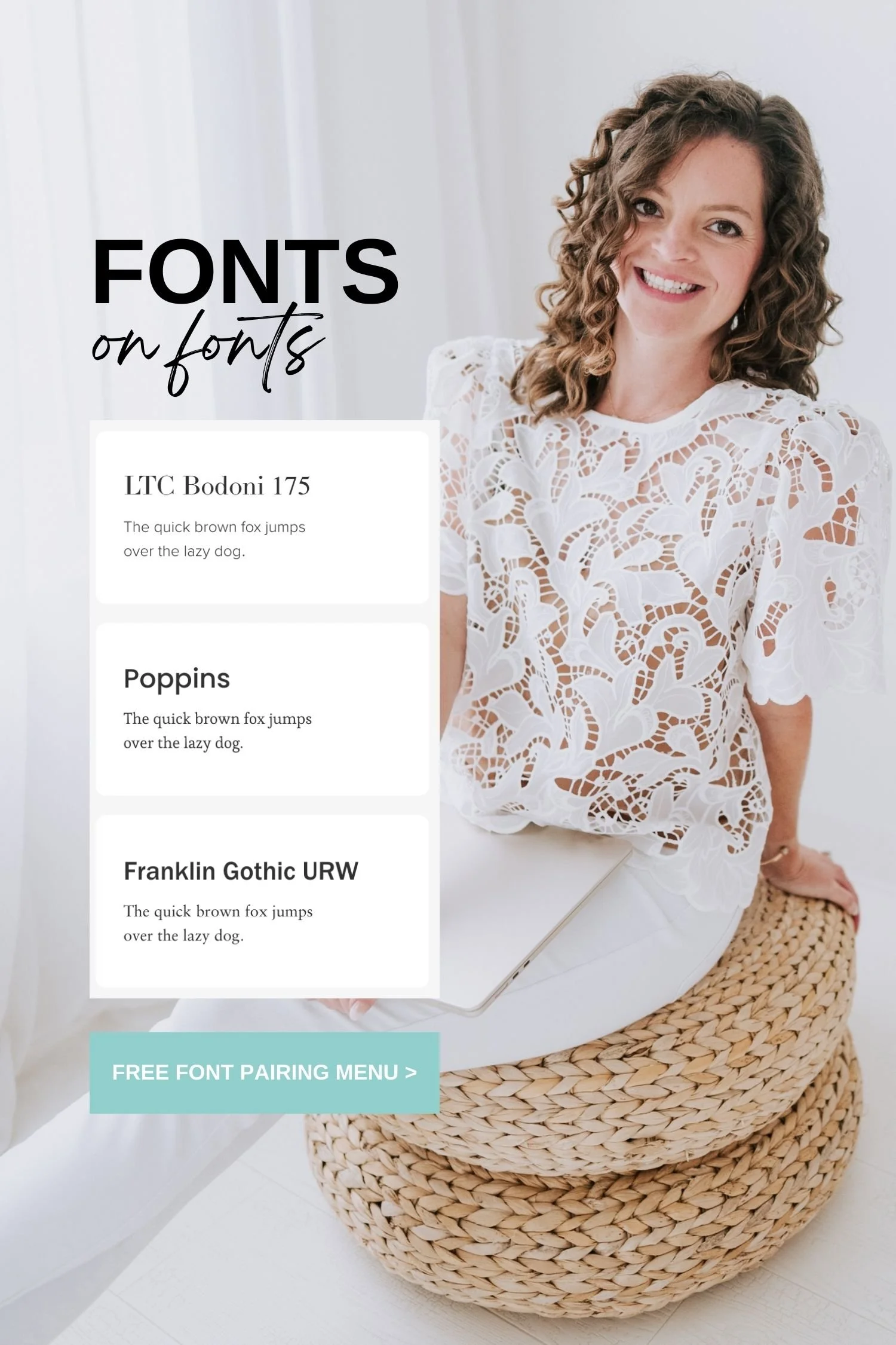
Font Menu
You’ll notice that the font pairings are broken up into 3 categories/pages: Sans Serif (ex: Arial), Serif (ex: Times New Roman), and Mixed. You’ll also notice that the Heading font names are listed, but the body/paragraph font names are not. I will list each font pairing below the menu pages and will also tell you how you can apply your font pairing choice to your Squarespace website, too.
These font pairings came directly from Squarespace. These are their preset font pairing suggestions for you to start with. So let me know in the comments if seeing fonts like this is helpful for you and if anything has caught your eye, I'd love to hear which fonts you're kind of drawn to.
But as you'll notice, as you look closer, you can see that the heading, the, like the Adobe Caslon Pro is the heading font and then underneath is just a sentence and each one has the same sentence. This sentence is actually a sentence that uses every single letter in the alphabet to give you a good overview of what the font would look like kind of in action, if you will. So if you're going to use these fonts outside of Squarespace, you can't just go and click these. You need to know what that font is called. Below the menu, I have listed out all of these font pairings with the names. So check out the menu, see if any of these catch your eye, or maybe you like, this heading font and this body font. I have listed all of the font names below by category/page so you can pick your font pairing or mix and match and create your own font pairing.
And just a little bit of advice here if this is overwhelming to you trying to pick a font pairing… I want to encourage you to remember that simple is better in this situation. As you can see here, like, I use Arial for my paragraph and button font. I did that intentionally because we are so used to reading that font! Your brain doesn't have to think twice to like read what my website says. I picked the most basic font on purpose because I want it to be easy to read and take in.
If you choose something that gets a little hard to read, people just aren't going to read it and they're going to leave your website or not read your social graphic or whatever it is. So, don't try to be cute or fancy when you pick fonts. Really think “simple is better.” Whatever catches your eye is a good thing. And I also want you to think of some really big name brands and their logos and the fonts that they use. Think of: YouTube, Unsplash, LinkedIn, Facebook, Vogue, Rolling Stone, Venmo, Squarespace, Forbes (see video for visuals). That's just a few examples but, as you noticed, all of those fonts are extremely simple. Even the logos are simple. This isn't a logo video, but just throwing that out there. You don't need anything extremely, extremely elaborate to make an impact, so simple is better.
Something that catches your eye, something that is easy to read, use these font pairing examples as a place to get started, or mix and match and make your own. And honestly, don't think too hard about it. Pick your brand fonts and stick to them in everything visual that you create. And if you haven't already, make sure to subscribe to my channel and check out the rest of this branding series. Again, designingtherow.com/branding for all the information and I will link to that in the description and pin it in a comment below so you can get to this font menu quickly and easily.
Note: If you already have a logo, I recommend using your logo font as your Header font for your website. And if you don’t have a logo (that’s totally fine), use the Header font of the font pairing you choose as your “logo” or Site Title (Squarespace will do this by default for you).
Click a Font Menu page below to view it full screen.


Font Names
-
Headings / Paragraphs
Aktiv Grotesk / Aktiv Grotesk
Pragmatica Extended / Helvetica Neue
Poppins / Poppins
Eurostile Extended / InterFace
Work Sans / Work Sans
Halyard Display / Halyard Display
Monotype Grotesque Extended /
Halyard Text
Acumin Pro / Poppins
Futura PT / Poppins
ITC Avant Garde Gothic Pro / ITC Avant Garde Gothic Pro
Anzeigen Grotesk / Neue Haas Grotesk Display
Franklin Gothic URW / Franklin Gothic URW
Antique Olive Nord / ITC Avant Garde Gothic Pro
Obviously Wide / Aktiv Grotesk
Anton / Neue Haas Grotesk Display
Roc Grotesk / Roc Grotesk
Audiowide / Acumin Pro Extra Condensed
Alternate Gothic No. 3 D / Omnes Pro
Archivo Black / Proxima Nova -
Headings / Paragraphs
Adobe Caslon Pro / Minion Pro
Linotype Didot / Adobe Garamond Pro
IvyMode / Athelas
HWT Aetna Extra Condensed / Amiri
Dapifer / Sanchez
Freight Text Pro / Adobe Caslon Pro
Kepler Std / Kepler Std
Orpheus Pro / Adobe Garamond Pro
Cormorant Garamond / Adobe Garamond Pro
Minerva Modern / Anziano
Baskerville Display PT / Freight Text Pro
LTC Bodoni 175 / Adobe Caslon Pro -
Headings / Paragraphs
Abel / Source Code Pro
IBM Plex Mono / Adelle Sans
Grange Extended / Lora
Adonis / Pontano Sans
HWT Aetna Extra Condensed / Franklin Gothic URW
Teimer Web / Liberation Sans
Cormorant Infant / Aktiv Grotesk Extended
Adobe Caslon Pro / Helvetica Neue
Granville / Brandon Grotesque
Jubilat / Raleway
Inknut Antiqua / Acumin Pro
Cormorant Garamond / Adelle Sans
LTC Bodoni 175 / Proxima Nova
Poppins / Esteban
Franklin Gothic URW / Linotype Sabon
Orpheus Pro / Neue Haas Grotesk Display
Neue Haas Grotesk Display / Georgia
How to apply the font pairings to your Squarespace website
When you’re logged into your Squarespace website and in edit mode of a page (any page), click the paint brush icon in the top right corner to access the Site Styles panel.
Click into Fonts.
Click “Switch” on the Font Pack that has been applied by default.
Click on Sans Serif, Serif, or Mixed option to find your font pairing choice.
Click on the pairing to apply it to your site. You will see changes made to your website page(s) immediately.
“Close” Site Styles panel and “Save/Exit” the page to officially save and apply your font pack selection.
Using your brand fonts outside of Squarespace
Squarespace offers SO many font options (many many more than the font pairing sets they’ve put together). You’d think those fonts would be available in Canva or Photoshop (or wherever else you might design) too, but that’s not always the case.
If you happen to choose a font that’s not an option elsewhere, you can either look to download the font file online and upload it as a custom font to Canva/Photoshop, OR just choose a similar font to use when working in other platforms.
Pin this post on Pinterest!
Subscribe to this branding video series to get all the free resource sent directly to your inbox!
Google Doc Branding Video Series Workbook • Font Pairing Menu • Canva Brand Guidelines Template
Want more website & branding advice? Here’s what’s new on the blog…

![How to use the Squarespace SEO Checker Tool [Live Client Walkthrough]](https://images.squarespace-cdn.com/content/v1/575f26468259b52cea323757/1776660680769-7OYZCOXHXCBD0A1PQ5MI/Squarespace+client+SEO.png)

Want a Squarespace discount?